Why reinvent the wheel if you can learn about marketing from others?
And you don’t even have to do an online course on digital marketing to gain some insight. Apart from helpful online articles, why not learn from the real thing like a marketing campaign or someone else’s use of their logo. Whether they hit the mark or made a total disaster of their campaign, there’s something you can get from their actions.
Below you’ll see very interesting scenarios about famous brands and their logos. Was it a hit or a miss? What lessons did the creators learn that can now benefit you?
A logo often forms the central part of marketing, since it represents you, each logo color plays a role in affecting your audience and it can instantly impress customers or put them off. So, for improving yours or designing your new logo from scratch, create a mood board and experiment with a color wheel. And while you’re doing it keep these lessons in mind so you can achieve the outcomes you’re after.
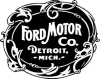
Ford and The Question of Logos Staying Up-to-Date
The Ford sign you’re familiar with today is actually not the original logo the company used back in 1903. That emblem was much more intricate, containing multiple words. Still, the emblem you see on cars now still has a very traditional, old fashioned font.
“this classic font reminds people of the quality and class associated with Ford”
Some may think this is a mistake on the brand’s part because so many companies decide to move with the times and update their logos regularly, using trendier fonts and graphics. But in the case of Ford, this classic font reminds people of the quality and class associated with Ford vehicles from the start. In such a scenario there’s no reason to transform a logo, because your logo is sharing the story of your company and reminding consumers of the trust society has in the brand.
The same effect is seen with Mercedes Benz that still uses the iconic star symbol. Once again this communicates elegance of old and helps consumers feel secure in still trusting the well-known brand. For your brand, update the logo every few years, but don’t forget to keep what’s working and attracting your customers.
Apple and the Lesson of logo Simplicity
We doubt you’ve seen Apple’s original logo design because it was only in use for a very short time. That logo showed a scene of a tree, Newton sitting next to it and an apple in the branches. This represented a grand idea, but luckily the company changed to only using the apple icon. We doubt the original design would have been as beneficial to this famous brand. For one thing, it was difficult to reproduce on different surfaces and very difficult to update in order to keep up with the latest trends.
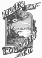
Figure 2 Courtesy of Medium
Nike and the Value of Logos Being Practical
Did you know the Nike sign was actually designed specifically for shoes? This in part guided Carolyn Davidson to create the Nike ‘swoosh’, long before the brand became famous for sporting apparel.
The other guideline was to create a logo that could represent ‘motion’ but without the practical application of using the logo on footwear, it could have turned out very differently. Luckily for the brand, that shoe logo is extremely easy to use on other clothing too, so the brand has no need to alter the design to fit their growing business.
“consider where you’ll use your logo”
In your business scenario, consider where you’ll use your logo and design something that’s practical to recreate there.

Figure 3 Courtesy of Wikipedia
Under Armour’s Versatile Brand Image
When you look at the range of places you may use your logo — print media, water bottles, T-shirts and more — it can seem too complicated to find a design that will work. That’s when you need to look at the Under Armour logo for some inspiration. Without even using different colours, Under Armour can reproduce it on printed media, clothing or digital marketing platforms and still be recognised instantly.
“Make sure your logo isn’t only practical for your main use”
Under Armour managed to create a unique shape that is easily distinguished from other logos, without making it too complicated. Now the brand can easily use this for various situations. Make sure your logo isn’t only practical for your main use, but for uses that you may consider in future too.

Figure 4 Courtesy of Under Armour
McDonald’s Excellent Use of Brand Colour
Of course, we’re not saying that you must only use black and white in your logo. McDonald’s is proof that use of colour is as important as having a versatile design. How would hungry patrons notice the sign if you can’t easily distinguish signage from other businesses in the street? The McDonald’s primary design of yellow arches on red shows how wise it is to use primary colours that consumers can easily notice against a backdrop of multiple other hues.
“even the logo can spark thoughts of food.”
Red also symbolises power and yellow reminds one of their tasty chips, so even the logo can spark thoughts of food.
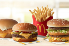
Figure 5 Courtesy of McDonald’s
Conclusion
In today’s competitive market, making your logo more compelling doesn’t have to be as difficult as you imagine it to be. Simply look to others and their journeys and you’ll discover how to sidestep a few problems and see the value of implementing dynamic elements in your logo.
To discuss how to fast track a successful identity for your brand, get in touch