We’ve come up with some captivating and creative design & marketing ideas to win attention for our clients.
We’ve also got more subtle ways to earn attention, but that’s not what we’re talking about today. Businesses and brands often want that idea with the ‘wow factor’. Something to hook people in and make them memorable.
Whether it’s for a trade show, a logo, a website, Direct Mail or a brochure:
that ‘wow’ factor needs to be meaningful. It should connect with people and also relate to the value you offer. Otherwise it’s just trying to get attention for the sake of it – all mouth and no trousers. Not a good look.
It needs to win the hearts of your audience. Attention needs to be earned.
Here’s 9 examples of our creative design & marketing ideas that won attention:
1. The ultimate calling card
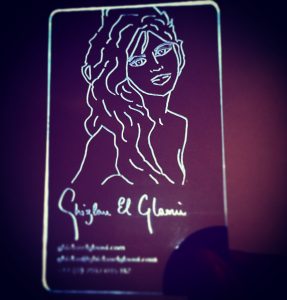
A calling card made of light, created for an artist who works with light. Just like the artist’s work, it conveys her unique style.
Using a technique called ‘total internal reflection’, the design only becomes truly visible once the recipient squeezes the corner. This completes the circuit, triggering the LED light and revealing the design laser etched into perspex.
This work was featured by Yahoo! News, Gizmodo, PSFK, Trendhunter and many more.
 2. What’s behind the Door?
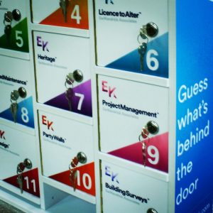
An eye-catching attraction to win attention for Chartered Surveyors. One glance is enough to understand they are experts at understanding property issues.
It was used at property trade shows and exhibitions as an ice breaker. It allowed them to get to know people and demonstrate their communication skills.
We devised a fun game for people – guess what’s behind the door. 12 locked doors, each one branded with a different service. Inside each door was an object relating to a question regarding that particular service.
 3. Video Brochure
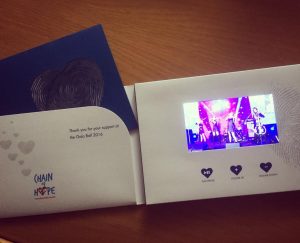
We created a video brochure for a charity specialising in heart surgery for children in the 3rd world.
It showed the effect on lives and how they work, with testimonials from children, the surgeons and high profile supporters. Their fundraising event was the centrepiece, as it is the biggest donation provider.
The video brochure is an HD 5″ screen embedded into a printed card cover. Upon opening, the video is triggered. There are video controls and a pocket, which houses a laser cut brochure and donation card with envelope.
 4. Aluminium Hoardings
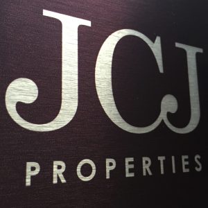
Good looking property hoardings can generate interest and excitement. It can also indicate the value of what’s being built or the value of the party involved in building it.
If you want to show you have genuine luxury, then a shoddy looking hoarding doesn’t cut the mustard.
We created hoardings with a brushed aluminium finish for a luxury construction company. It highlights their contemporary design thinking and clever use of interesting materials.
 5. Buzzwire
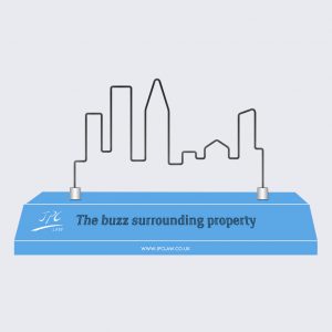
A giant buzzwire in the shape of a cityscape for a property law firm with matching exhibition graphics. It’s a fun way to communicate how tricky property law can be.
It references the idea of peace of mind. Not being ground down by the ins and outs of property legal issues. Instead you do the exciting stuff and leave the complex, boring legal issues to them.
It was an immediate, visual way to show their property expertise and have a fun, interesting way of breaking the ice. Winning attention and keeping it.
 6. One Pence Banksy
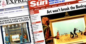
A beer brand wanted a profile raising concept to target the ‘cool crowd’.
So we raffled a Banksy print for 1 pence. We created a website, printed material and designed various shop units on Carnaby Street advertising the event, which attracted far larger crowds than expected. It was featured in most national newspapers and also TV news.
 7. Live Social PR Website
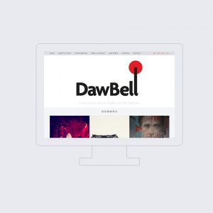
An online brand experience for a PR agency using live social feeds.
PR websites usually try to look cool. Typically a few tweets are shown on their website, with the rest hidden behind social media icons.
We wanted to demonstrate a vibrant, reputable business that are experts in communication. Transparency – no smoke and mirrors. This PR agency deserved to have their skills shown off.
So, the website homepage is made up of live feeds from all their social media channels. Tumblr, Twitter, Instagram, Facebook – the lot. It’s an honest and authentic demonstration of what they do.
 8. Live Painting
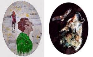
For Becks using art to support their brand values, we did live painting at a live music event.
Canvases were used in the shape of Becks beer bottle labels. The designs reflected the actual art Becks were using on some of their bottles.
 9. Building Relationships
We came up with the strap line ‘building relationships’ for a property services company.
Then we created adverts, printed literature, exhibition graphics, email campaigns in that theme. Using a brick style layout of images and typography.
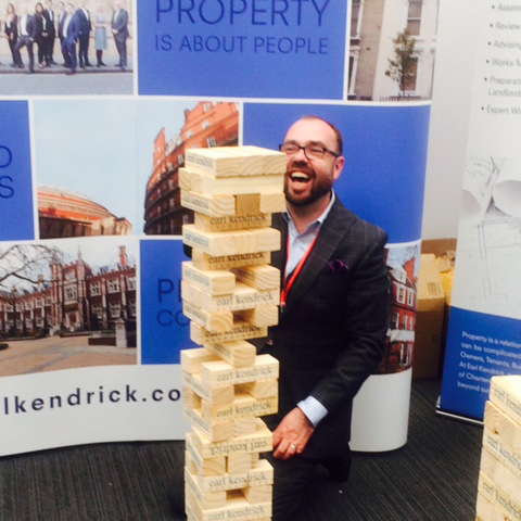
But best of all was a branded giant jenga set to accompany it all. Each piece was branded by hand using a giant ink stamp. This gave a unique and striking analogue look.
The game meant they were literally building relationships with people.
