Colours brand meaning and which are best suited for your brand
If you’re expecting to see a list of different colours meaning for brands, then sorry to disappoint. Those articles are absolutely everywhere, so you shouldn’t have any trouble finding one. But thanks for visiting!
Ok, now we’ve separated the wheat from the chaff and got rid of that lot, it’s just you and me.
So let’s talk honestly about brand colours and their meaning.
All those articles listing the meaning of colours aren’t very useful: “blue is a calming colour used by corporates” etc. In reality it’s more nuanced than that, so categories aren’t very helpful.
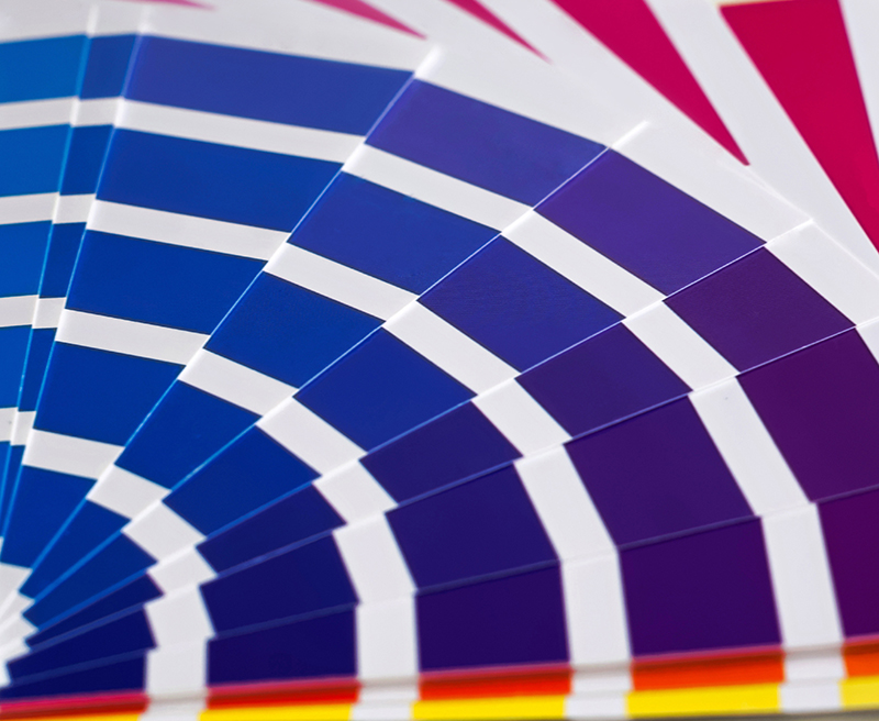
Colours can mean lots of things. And those things can be positive or negative. Different shades of the same colour can give a completely different feeling. 

For example, a bright yellow and a muddy yellow have a completely different effect. Also, the meaning can change from culture to culture.
How will I know the right colours for my brand?
A colour palette is part of your brand identity. And the essential part of brand strategy is understanding your value. The reasons people buy from you and what motivates them. The human, emotional connection.
Your logo, typeface, imagery, copywriting and colour palette should all support that idea. It’s how you create a compelling brand. Don’t get bogged down in colours meaning. Instead, discover what your brand represents and use colour to convey that.
 Creating a colour palette is like an art – you can create a mood. A narrative with a dash of some other ingredients.
It can be luxurious, nuanced, simple, sombre, strong or anything else you want it to be.
So creating a colour palette is an art that supports how your brand resonates with people.
Art and marketing combined. That’s how to pick the best colour. Those lists didn’t mention that did they?!