The Big A rebranding was well overdue.
Our old brand identity was looking dated and no longer accurately communicated what we did – both great reasons to rebrand.
We examined our market position & why people used The Big A – our brand proposition. We looked at what motivated people to buy from us on a human level. Out of the research we built a brand strategy and the brand identity was created around that. Our brand succinctly expressed in a few words was ‘Attention-Winning-Design’.
The logo came out of a combination of ideas:
• The peacock – associated with getting attention.
• The exclamation mark – indicates dramatic effect and strong feelings.
We were also inspired by an emoji – the motion lines of hands in the air, the symbol of celebration (suggesting something positive has occurred) ?
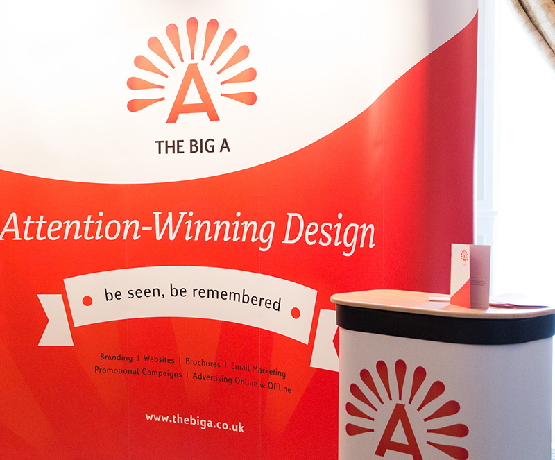
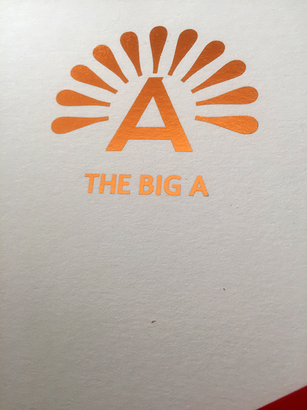
We drew a fairly wide ‘A’ character with a low crossbar for a sturdy but elegant look. The top corner was subtly extended to look like a beak, consistent with the peacock concept.
We used a gradient, not because it is a current trend, but because it was consistent with the peacock part of the idea.
The warm bright colours added a sense of vibrancy – a dynamic, exciting brand that can think outside of the box. On some printed material the logo was produced using a copper foil, adding a different dimension.
Rather than designing the type of website that was expected and typical of the sector, we went for something more suited to our proposition.
Design without the usual design industry cliches meant we communicated our brand accurately. We focused on our approach and the reasons clients use us, which allowed the brand identity to flourish.