Differentiation doesn’t mean standing out.
It means standing shoulder to shoulder with the customer, and outclassing the competition.
It’s common to default to a rigid, formulaic design. But design needs to resonate with people. Design should bring clarity and be compelling.
It needs to position your brand in the mind of the customer, so they want to reach out to you. Connecting with people and staying in their minds affects the quality of enquiries you’ll receive too.
Convention can hold back your marketing. Investing in design to look like everyone else isn’t good for your promotion or sales.
Brand design can give clarity and resonate with people to outclass the competition.
We approach things differently. It’s all about understanding people.
We start by creating a plan to outclass the competition. Our strategy is about how people can connect with your brand on an emotional level. It’s how to create a compelling brand design that resonates with people. It needs to be done using a clear, authentic voice.
Case Study
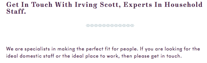
Irving Scott are a boutique luxury brand, specialising in domestic household staff. It’s a niche service for an exclusive market. We went about understanding their brand and how that could resonate with people.
We identified trust as their emotional connection with people and something that motivated people into buying.
In their case, this manifested itself as ‘finding the ideal match’. It was their main strength and authentic – no-one else in their marketplace offered this value. A clear differentiator that would be enticing.
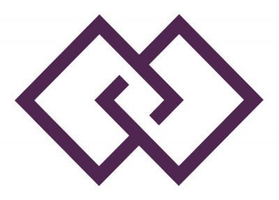
Brand Identity
We created an emblem to represent their value and convey the idea of the ideal match. It was inspired by the shape of a bow tie and the classic diamond pattern (typically found in buildings)

It also gave the brand identity flexibility, could be used as a repeating pattern and applied in other ways to help brand recognition.
![]()
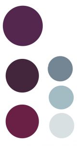
The logo used typography that looked elegant, minimal and trustworthy. The purple softens the motif, while it’s richness adds a sense of exclusivity and gravitas
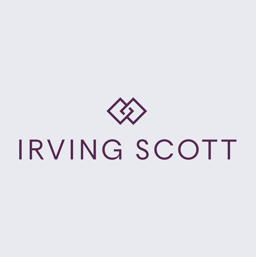
The colours were a mix of energetic and restrained colour variations. Perfectly harmonised for that ideal match sensation
For balance, traditional and luxurious typography compliments the contemporary dynamic typeface.. Both look sleek with details that add charisma.
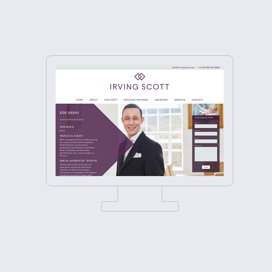
The Website Design
The website fleshes out the values conveyed in the logo. It was an opportunity to create interest and built trust.
This approach encourages visitors to explore, as they gain insight into the expertise and value on offer. We used photography to allow them to demonstrate what they do best – their insight into people and their ideal employment match.
We used a strong but simple ‘Call To Action’ on the image, for clients to get in touch easily – a key objective.
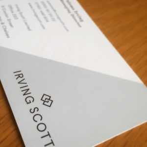
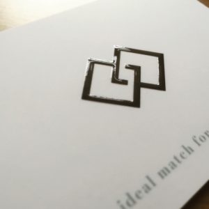
Printed Material
Printed communications and online experiences are two very different mediums. So, a slightly different execution is often required
We used a simple dynamic shape to add energy to the minimal, elegant design. The reverse uses the motif with a gloss varnish and supporting copy underneath.